The Benefits of Simple Web Design
Simplicity is key to a successful web design. Simple web design benefits visitors by making your website easier to read and navigate. This is key to encourage the staying power of your website visitors. To attain this simple web design, consider five useful guidelines: the 80-20 rule, element elimination, being concise, considering the “above the fold” element and focusing on the colour scheme. By abiding by these simple guidelines you can make more focused design decisions when it comes to layout, user experience and user interface.
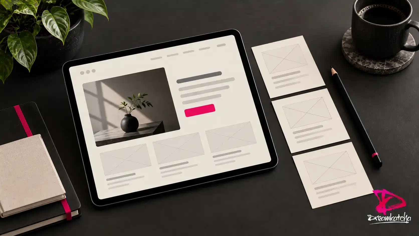
Prioritise the most useful elements
Paying too much attention to detail with every aspect of your own website is an easy and common mistake to make. This can result in a website that is too busy to enable the visitor to focus on the necessary elements of your business, such as your product range. Therefore one of the foremost things to do when building your website, is to define the important elements and focus on such. The 80-20 rule is a useful prioritisation guideline: a small number of elements may provide most of the value. Treat this as a design heuristic, rather than a fixed measurement or ranking formula.
Eliminate unnecessary elements
By focusing on the most useful content, you can eliminate unnecessary elements to reduce the cluttered effect on your website. This will in turn help your visitors to remain focused whilst browsing your website. They are presented with an easy to read and straightforward to navigate website, encouraging them to explore further.
Be concise
Being concise with your website will further reinforce the above two mentioned rules. It helps reduce confusion for your visitors, reducing the chance of distraction to your selling range of products and most importantly helps them find the information they need. Pages of your website that have similar content can be fused together, where they serve the same purpose, creating information that is concise and easy to digest.
Above the fold
“Above the fold” refers to what the readers can initially see on their screens without having to scroll down. Use this area to explain the page’s purpose clearly, while keeping useful detail available further down. It is your opportunity to attract the reader’s attention and to entice them to further explore your page, by wanting and needing to scroll down the page. A useful way to help you achieve just that is to reconsider the size of your font, headers, pictures and logos.
Colour scheme
Colour scheme is an important topic in many subject matters. It is also an important element to focus on when referring to your website. Again, simplicity is key. An over colourful website might at first seem to be a good idea but when considering it from a reader’s perspective, it isn’t quite so. Too many competing colours can distract readers from your content. Check text and background contrast using W3C’s accessible design guidance so that readability remains a priority. Therefore you may prefer to use different shades of your chosen colour or even just using the more traditional black and white scheme.
Using these guidelines can help visitors find their way around your website and understand your content. It enables you to have a simple website that is still attractive to your potential clients. For more practical advice, read our guide to website usability.
Contact Dreamkatcha today to discuss a startup business, web design or logo design project.